Common Room’s product had evolved rapidly, resulting in visual inconsistency, dense interfaces, and unclear activation paths. Customer feedback consistently pointed to friction in understanding where to start and how to extract value.
We needed to improve usability while preserving product depth.
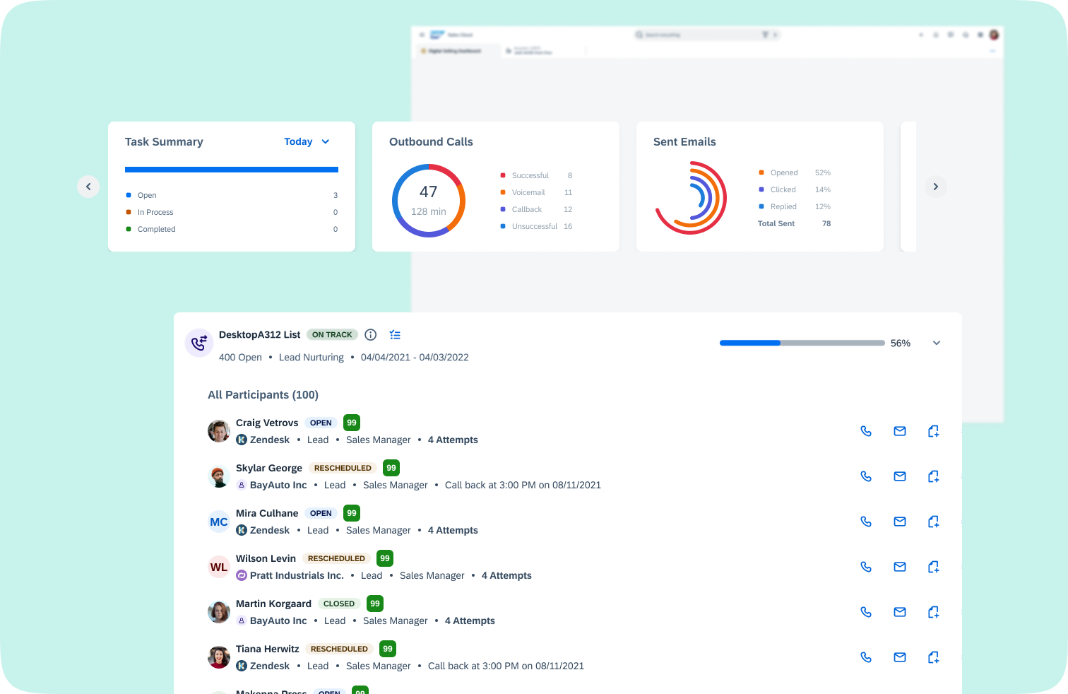
Users struggled with:
The product delivered insight, but not clarity.
We shifted Home from a static overview page to a segment-driven workspace:
This aligned product structure with how revenue teams actually operate.
We:
This improved scannability without removing depth.
Instead of designing by feature, we structured around user intent:
This created clearer mental models across the platform.