
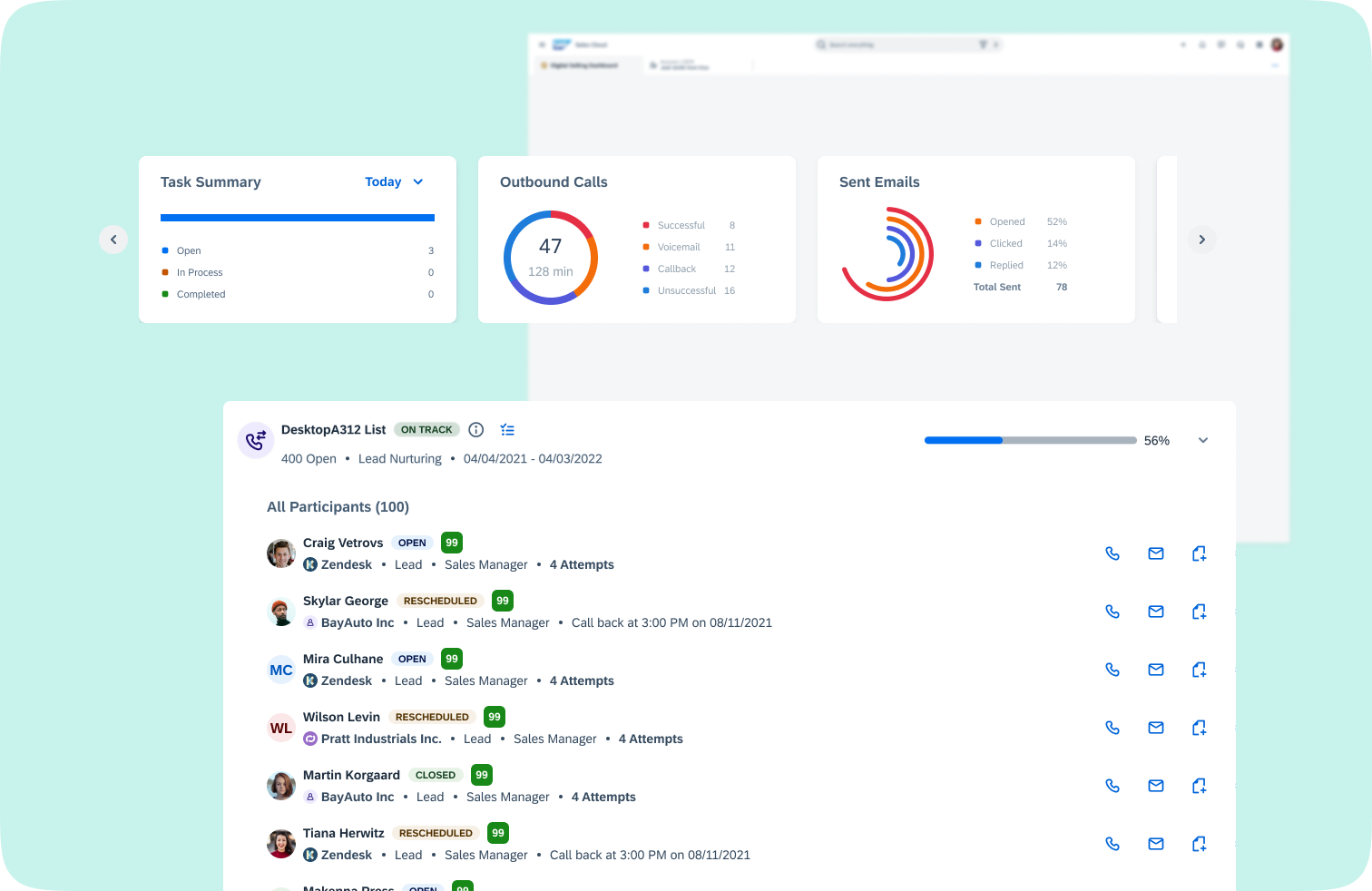
Digital Selling Dashboard is a new workspace within SAP Sales Cloud and is a sales representative centric dashboard. In here, the sales representatives can access all their to-do items and KPIs as well as any engagement signals. This workspace is crucial to the sales representatives as they want to view all their responsibilities in one place.
This was the first project that was handed to me as I joined my current team (C4C/Cloud for Customers). Although there were a few design flows created by the previous design owner of this project, there were a lot of missing pieces I had to fill in. As the new design owner of this project, I had to create new design flows and enhance the existing flows following our expanded version of our design system.
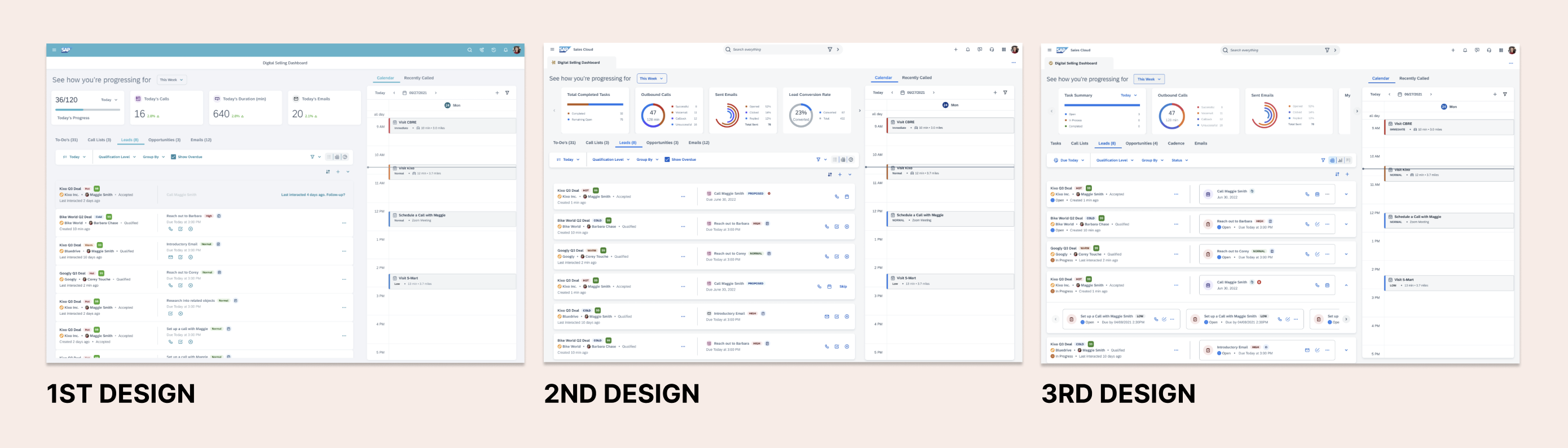
The biggest challenge I faced with this project was to globally align with other workspaces.
As the design owner of this project, I led and collaborated with development team and a product manager to understand requirements for the ask. Together, we reached out to some of the other designers on the Sales Cloud team and Service Cloud team to gain insights on what was already being done on their interfaces and how we could improve the experience for our new workspace.
As digital selling dashboard is a place that holds all the datas and information the sales representatives need in order to perform their jobs, I had to consistently communicate with other workspace product owners, designers, and product managers to grab the right set of datas and show similar information following SAP Business One protocol.
Create the components and patterns fit for DSW standards and requirements, THEN enhance the DSW components and patterns to align with other workspaces' standards and requirements.
Before jumping into solutioning, I spent a significant amount of time studying our current Digital Selling Dashboard page. The dashboard featured all the required fields and information on the page, but with mass information showing in one screen, it was a bit overwhelming. This was a huge pain point for users, and I found myself needing to look elsewhere to refresh and reset.
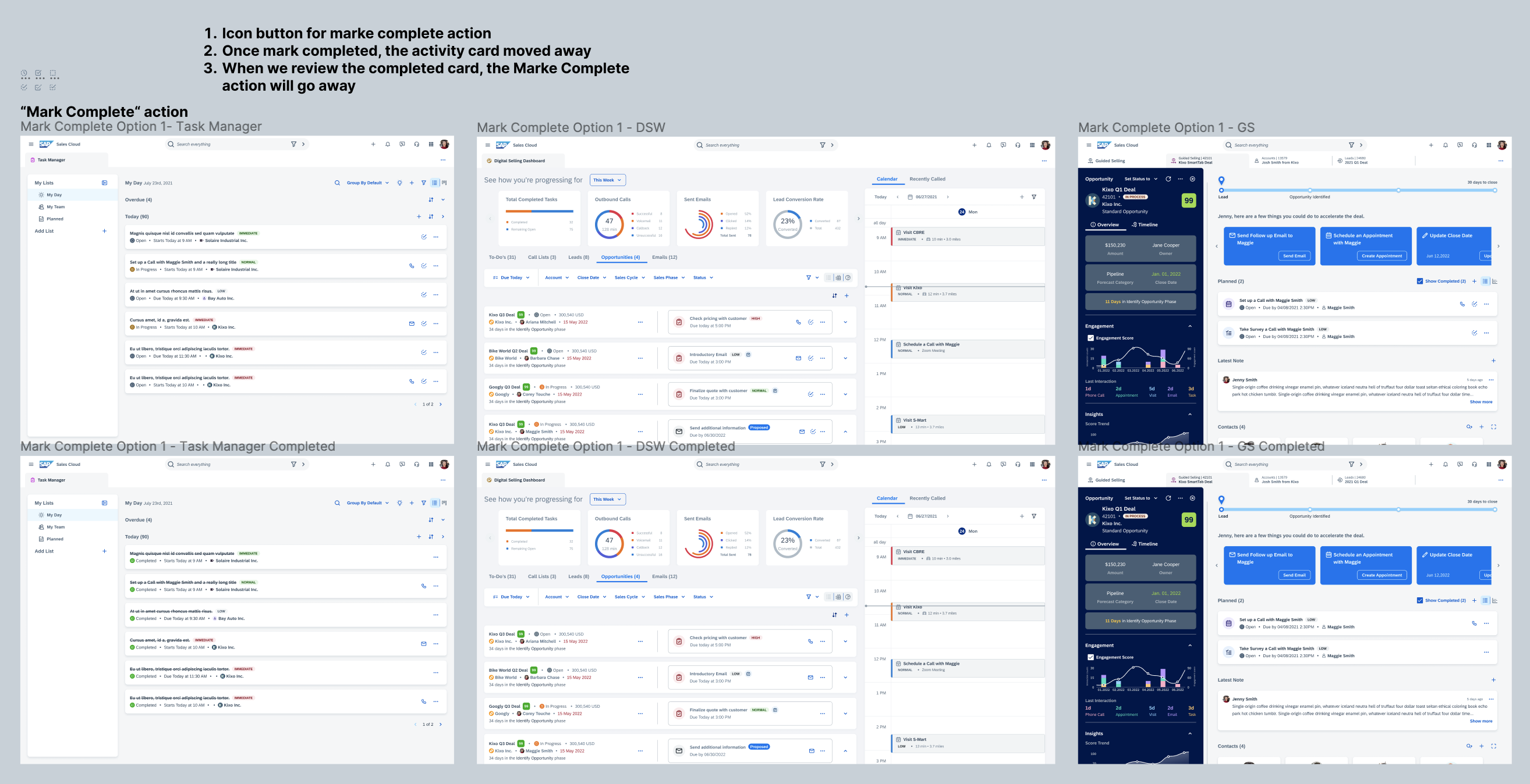
In the first phase of our design, we had to show lead and opportunity workspaces in our dashboard. There were two challenges we faced when creating spaces for both leads and opportunities. First, leads don't have a lot of information to display from the start. Second, opportunities on the other hand have lots of information to display from the beginning. So, I started to gather all the required information that we need to display for our end users. There were additional requirements added where we had to show 'to-dos' or 'tasks' related to the specific leads and opportunities in the same place along with action buttons for those specific 'to-dos' and 'tasks'.

In parallel with figuring out how the visual treatment of the dashboard might look like, I also then began to imagine what the interactions of the dashboard would be, and how the dashboard would actually function. Many questions came up at this time. How would action buttons be triggered? How can we show both lead information AND the activity information in one card? How can we display multiple activities for a single lead? There were all really important design decisions that challenged me to think about edge cases and what different users' experiences would be if they had different goals using the dashboard.
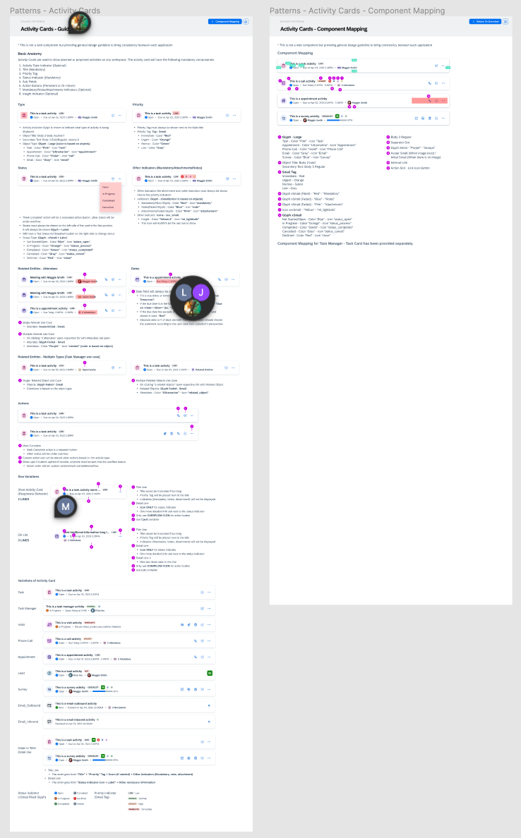
I proposed a new component called 'Activity Cards' used in the dashboard to the team. The Sales Cloud team, which includes mobile, survey, sales quote, guided selling and many more, were in need of activity cards but the component itself and the pattern were not defined. I created a design pattern that defined not only the component's default behavior but how it would apply in different use cases. For the global alignment workshop that I hosted for an hour long, we were able to agree on certain design patterns of the activity cards.
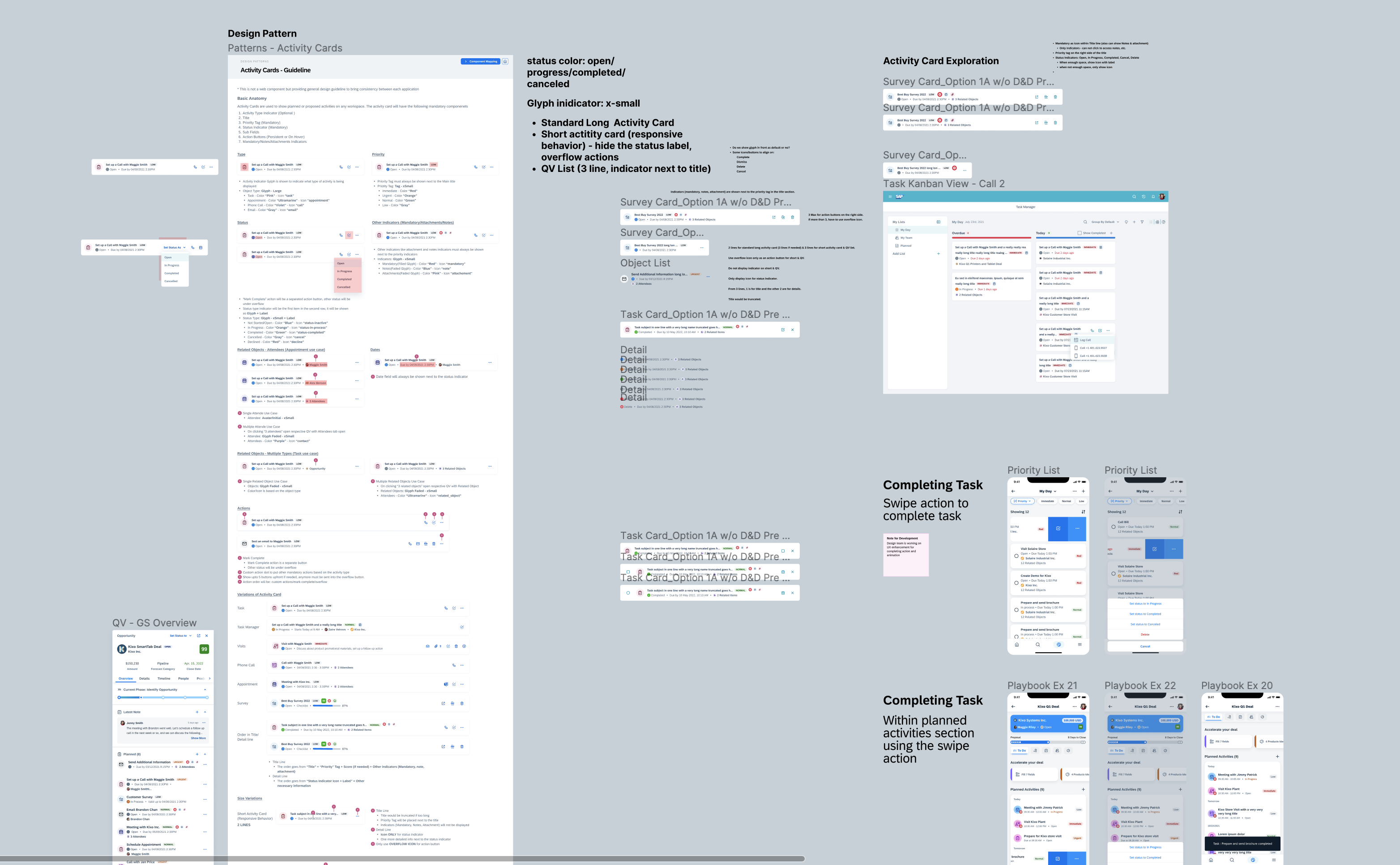
Working closely with the components team, I was able to refine the 'activity cards' patterns and guidelines to the really nitty gritty details, like the edge cases, color usage, and even the number of action buttons to show. The most challenging part of this was figuring out a pattern that can work for all. After many iterations and a few more workshops, we were able to finalize on the patterns and guidelines for 'activity cards'. We ended up creating a new 'mark complete' icon that would be used in all activity cards for a better visibility and clarity on the action provided.
This was definitely a long journey and I only included high level information of the journey here but it was definitely worthwhile as well. It was honorable to see the component and its behavior that I created used in multiple workspaces of our sales cloud system.
It again solidified my belief that all great design comes with multiple iteration.
You might have a great idea to start off with but that always needs to be refined and refurbished into a workable and usable idea. This project is still ongoing and it has made a lot more progression since the end of this journey. Now we are actively testing out this workspace with our potential customers and consistently making UX validations on staging.